Despite the 20th-century trajectory towards ever-greater precision, mapping mistakes continue to endure through to the present day. Yet, these modern cartographic phantoms have also had real-world consequences, ranging from harmless reprints to executive firings and even murder. This post covers five such cases from the modern era, each more impactful than the last.
The phantom towns born from a football rivalry
These two non-existent towns made their fleeting appearance on the official 1978–1979 edition of the Michigan state highway map. Their creator was Peter Fletcher, a University of Michigan alumnus who, at the time, served as chairman of the Michigan State Highway Commission and possessed what was described as a “sly sense of humour”.
Fletcher had been playfully teased by a fellow Michigan alumnus about the Mackinac Bridge being painted green and white—the colours of their rival, Michigan State. Fletcher explained that the bridge colours were dictated by federal highway regulations and thus beyond his control. However, the content of the state highway map was a different matter.
 Source: michigan.gov
 Source: michigan.gov
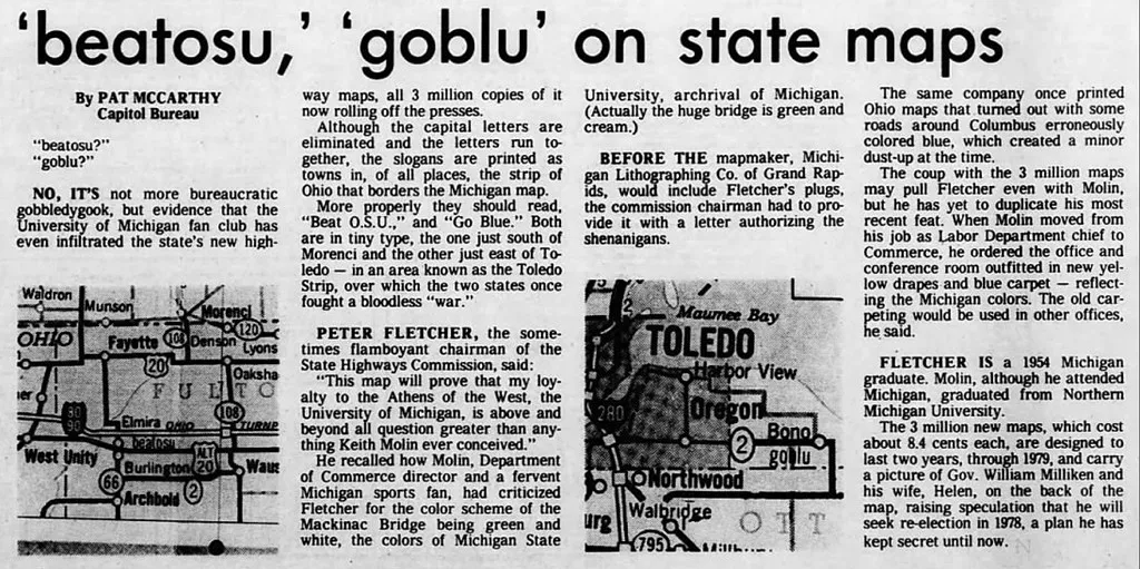
Seizing the opportunity, Fletcher ordered a cartographer to insert two fictitious towns onto the map. The names were carefully chosen: “Goblu,” a clear nod to the University of Michigan Wolverines’ cheer “Go Blue!”, and “Beatosu,” a rallying cry to “Beat O.S.U. (Ohio State University),” another major rival.
These phantom towns were strategically placed just across the border in northern Ohio, the heartland of Ohio State supporters. As a subtle wink, the names “goblu” and “beatosu” appeared in all lowercase letters on the map, unlike the capitalised names of all other legitimate towns, and lacked any specific dot or boundary marker.
 Source: Lansing State Journal
Once the public noticed this prank, a costly reprint was ordered, with the limited run of maps featuring Goblu and Beatosu quickly becoming sought-after collector’s items. Adding to the lore, the University of Michigan Wolverines defeated Ohio State 14–3 in their annual football game in 1978, the year the map was published, leading some to consider the prank a good luck charm.
The plagiarist trap that came to life
Among the peculiar denizens of the phantom world, Agloe, New York, holds a special place. It was not born of an explorer’s error or atmospheric trickery, but as a deliberate fiction designed to catch thieves. In 1925, Otto G. Lindberg, founder of the General Drafting Company, and his assistant, Ernest Alpers, created Agloe as a “copyright trap” or “paper town”.
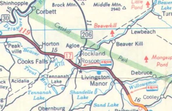
They assigned an anagram of their initials (O.G.L. + E.A.) to a then-unremarkable dirt-road intersection in the Catskill Mountains – specifically, at NY 206 and Morton Hill Road, north of Roscoe, New York. Agloe was intended to be a unique, fictitious entry; if it appeared on a competitor’s map, it would serve as evidence of plagiarism. The phantom town subsequently appeared on numerous maps produced by their company for Esso.
 Source: archive.org
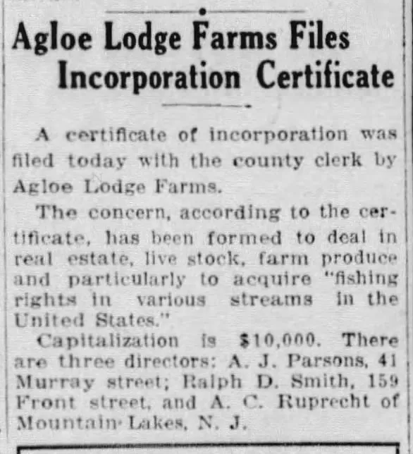
The story of Agloe took a truly outrageous turn when the fiction seemingly willed itself into a semblance of reality. When rival mapmaker Rand McNally published a map in the 1950s that included Agloe, General Drafting accused them of copyright infringement. Rand McNally’s defense was unexpected: they claimed Agloe was a real place. According to their research, Delaware County records indicated that a business named “Agloe Lodge Farms” had been incorporated in 1930 and had acquired a fishing lodge in that area, renaming it Agloe Lodge.
 Source: newspapers.com
The presence of a business adopting the name “Agloe” at or near the mapped location provided Rand McNally with a defense against the plagiarism charge. The mapmakers’ creation had, in a bizarre twist, attracted reality to itself.
Agloe continued to appear on various maps for decades, and was still there on the last American Map issue of New York state for Exxon in 1998. It also made a brief appearance on Google Maps, before largely fading from official cartography.
In a nod to its unique status, the United States Geological Survey added “Agloe (Not Official)” to its Geographic Names Information System database on February 25, 2014.
The Pacific ghost that fooled scientists
For over a century, Sandy Island, sometimes labeled Île de Sable or Isla Arenosa, haunted maps of the Coral Sea near the French territory of New Caledonia. Its cartographic life began with plausible, if perhaps misinterpreted, sightings. Captain James Cook noted a “Sandy I.” in the vicinity in September 1774. Over a century later, in 1876, the whaling ship Velocity reported “heavy breakers” and “Sandy Islets” in the area, further cementing its place on nautical charts.
 Source: NLA
Given its location on a pumice ‘superhighway’ some believe its original sightings could be of giant pumice rafts.
 Source: NASA
The island subsequently appeared on numerous authoritative maps and nautical charts, including those from the British Admiralty (1895), New Zealand charts (1908), and National Geographic Society maps, persisting well into the 20th and even the early 21st century. Despite its removal from official French hydrographic charts in 1974 following a flying recognition campaign, and from Australian Hydrographic Service (AHS) charts in 1985 following another search, Sandy Island lingered in global digital databases.
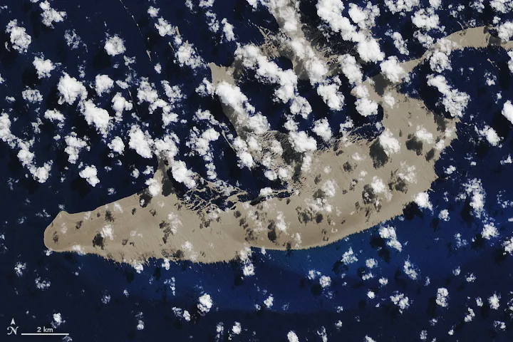
The final act in its long story of non-existence came in November 2012. Scientists aboard the Australian research vessel RV Southern Surveyor, intrigued by the discrepancy between different maps, sailed to the island’s charted coordinates. Instead of land, they found only the deep blue of the Pacific Ocean, with depths never less than 1,300 meters. The publicity from this voyage marked the definitive “undiscovery” of Sandy Island, even though they were not the first group to realise the mapping error.
How did such a significant phantom persist for so long, even into the age of satellite mapping? Critically, in the modern era, digital datasets became unwitting accomplices in perpetuating the error.
 Source: geogarage
The answer appears to lie in the World Vector Shoreline (WVS) database, a dataset produced by the US National Imagery and Mapping Agency during the conversion from hard-copy charts to digital formats. This digital Sandy Island – an artefact – eventually propagated through into other influential datasets and digital maps, like Google Earth and the General Bathymetric Chart of the Oceans (GEBCO), which reported an elevation of 1 meter at Sandy Island’s location. The widespread appearance of Sandy Island thus became a digital echo of a decades-old mistake.
The Apple Maps fiasco of 2012
The launch of Apple Maps with iOS 6 in 2012 proved that the digital age could create cartographic phantoms on an unprecedented scale, moving beyond single phantom islands to generate widespread, and sometimes dangerous, inaccuracies. The problems were not isolated glitches but a systemic failure that produced a range of modern map phantoms.
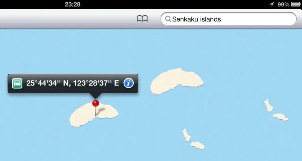
The errors ranged from the geopolitically awkward to the life-threatening. One of the most notable was the duplication of the Senkaku/Diaoyu Islands, a real but intensely disputed archipelago. Apple’s map rendered two distinct sets of islands; a search for the Japanese name “Senkaku” would pinpoint one, while a search for the Chinese name “Diaoyu” would identify another cluster nearby.
 Source: ogleearth
This digital doppelgänger likely arose from the difficult integration of conflicting datasets from different providers, including a potentially intentionally offset Chinese dataset. The error sparked some geopolitical humour, with jokes that Apple had found a novel solution to the territorial dispute by giving an island to each claimant.
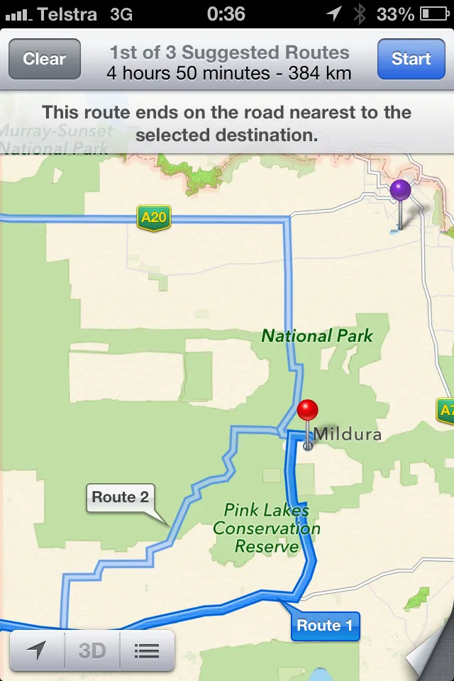
However, other errors had far more serious implications. In Australia, the city of Mildura was misplaced by about 70 km into the middle of Murray-Sunset National Park. This error was deemed potentially life-threatening by local police, who had to rescue multiple people stranded in the harsh environment without adequate water supplies.
 Source: Victoria Police
The Mildura error was tracked down to the source data used by Apple, specifically from the Australian Gazetteer – an authoritative list of >380,000 placenames. Rather than using coordinates for the city itself, the mistaken point was instead the centre of the local government area carrying the ‘Mildura Regional City’ tag.
In Ireland, the Minister for Justice and Defence issued a public warning about a non-existent airport shown near Dublin, which was in reality a public farm. The minister noted the danger this phantom airfield posed to pilots in an emergency. Beyond these major blunders, the service was riddled with smaller mistakes: Stratford-upon-Avon was missing entirely, London, UK was confused with London, Ontario, and major landmarks like Paddington Station were absent.
The impact of the 2012 iOS 6 update is a stark cautionary tale about the fallibility of digital cartography without sufficient human curation and verification. It was a major corporate embarrassment for one of the world’s largest tech companies, which forced a rare apology from its CEO, Tim Cook and the firing of several senior employees.
The Arctic mirages that precipitated murder
The race to the North Pole in the early 20th century was a theatre of intense ambition, personal rivalry, and, as it turns out, phantom geography. Two of the era’s most significant phantoms, Crocker Land and Bradley Land, were born from this competition, serving as cartographic weapons in the bitter feud between explorers Robert E. Peary and Frederick Cook.
Following his 1906 expedition, Peary reported sighting a vast landmass from the summit of Cape Colgate on Ellesmere Island, describing it as “the snow-clad summits of a distant land” about 130 miles (210 km) away. He named it Crocker Land after George Crocker, one of his financial backers, likely in an attempt to secure more funding. However, Peary’s own diary from the time noted that no land was visible, suggesting the claim was fraudulent.
 Source: LoC
A few years later, in 1909, Peary’s rival, Frederick Cook, claimed to have seen his own phantom landmass in the same region, which he named Bradley Land after his own sponsor, John R. Bradley.
 Source: Wikimedia
These competing claims became central to the explorers’ dispute over who had first reached the North Pole. Cook asserted he had travelled through the area of the supposed Crocker Land and found nothing; therefore, proving its existence would discredit Cook’s polar claim entirely.
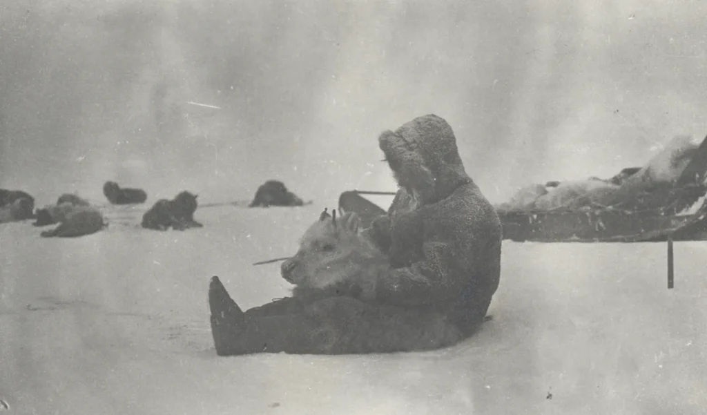
This rivalry fueled the ambitious Crocker Land Expedition (1913-1917), organised by Donald Baxter MacMillan and sponsored by prestigious institutions like the American Museum of Natural History. The expedition was fraught with peril, including a drunken ship captain, extreme cold, and severe frostbite.
In April 1914, after a grueling trek across the sea ice, MacMillan’s party sighted what appeared to be their goal. MacMillan described “Hills, valleys, snow-capped peaks,” but his experienced Inughuit guide, Piugaattoq, immediately identified it as a mirage. After five more days of chasing the illusion, MacMillan was forced to concede that Crocker Land was nothing more than a Fata Morgana, a complex atmospheric mirage.
 Source: LoC
The Crocker Land Expedition was a monumental waste of resources and effort, but its impact became truly outrageous and tragic with the murder of the Inughuit guide Peeahwadlootoq (Pee-ah-wah-to) by expedition member Fitzhugh Green during the stressful return journey. No legal action was ever taken against Green.
 Source: American Museum of Natural History
 Source: American Museum of Natural History
Cook’s claims of reaching the North Pole were ultimately heavily refuted; photographs he supposedly captured at the pole were found to be cropped pictures of Alaska taken years previously. In 1911 the US Congress formally recognised Peary as reaching the North Pole first. However, a reanalysis of his records in 1989 by the US National Geographic Society (also an original sponsor) concluded his expedition came within just 8 km of the true pole.
The saga of Crocker and Bradley lands demonstrates how seemingly innocuous “discoveries,” born of deception, rivalry, or optical illusion, can precipitate very real and devastating consequences.
Be First to Comment